Tiiny Host
The simplest way to host and share your work online

Design and exploration of a file sharing service’s website to market their customer plans
Client
Tiiny Labs
HQ
London, UK
Company size
2–10 employees
Industry
Technology, Information and Media
Services
Branding
Design System
Web Design
Testimonial
"Lee has been an incredible asset for our small team helping us with everything from complex UX problems to polishing our brand. Whilst there are many design agencies & freelancers out there, it's incredibly rare to find someone as responsive as Lee who delivers to such a high creative standard."

Elston Baretto
CEO & Founder, Tiiny Host
Introduction
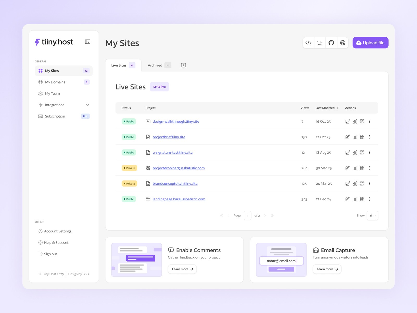
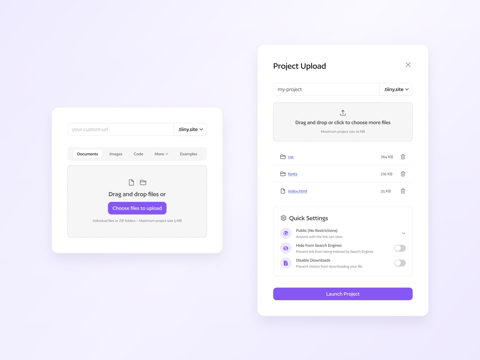
With Tiiny Host, you can drag and drop an HTML, ZIP or PDF into the upload box, type in a link-name or leave it blank, and then hit the Upload button to get a shareable link. Perfect for those looking to deploy websites, store academic works and white papers, and share digital marketing collateral.
Challenge
Tiiny Host’s visual identity wasn’t consistently applied across the platform, leaving the interface feeling fragmented and lacking cohesion
The homepage wasn't communicating the product’s core values clearly, making it harder for new users to quickly understand what Tiiny Host offered
Content across the site had become cluttered and needed refining to improve clarity, hierarchy, and overall readability
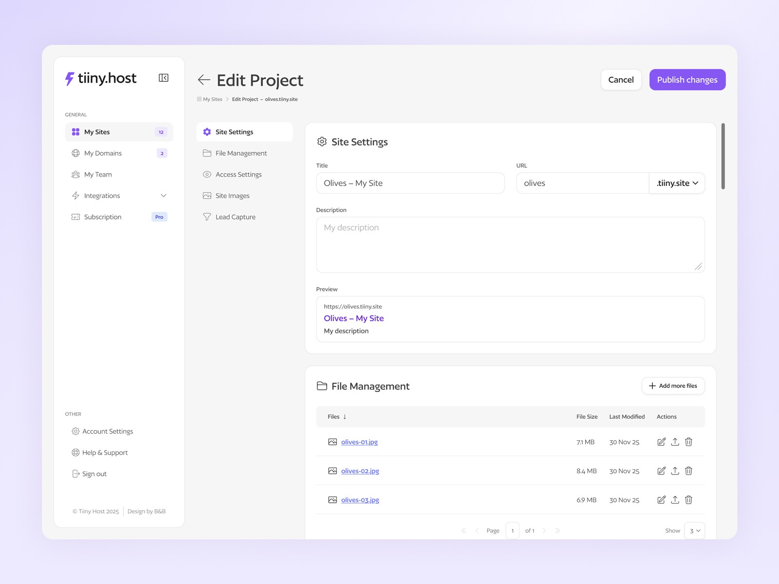
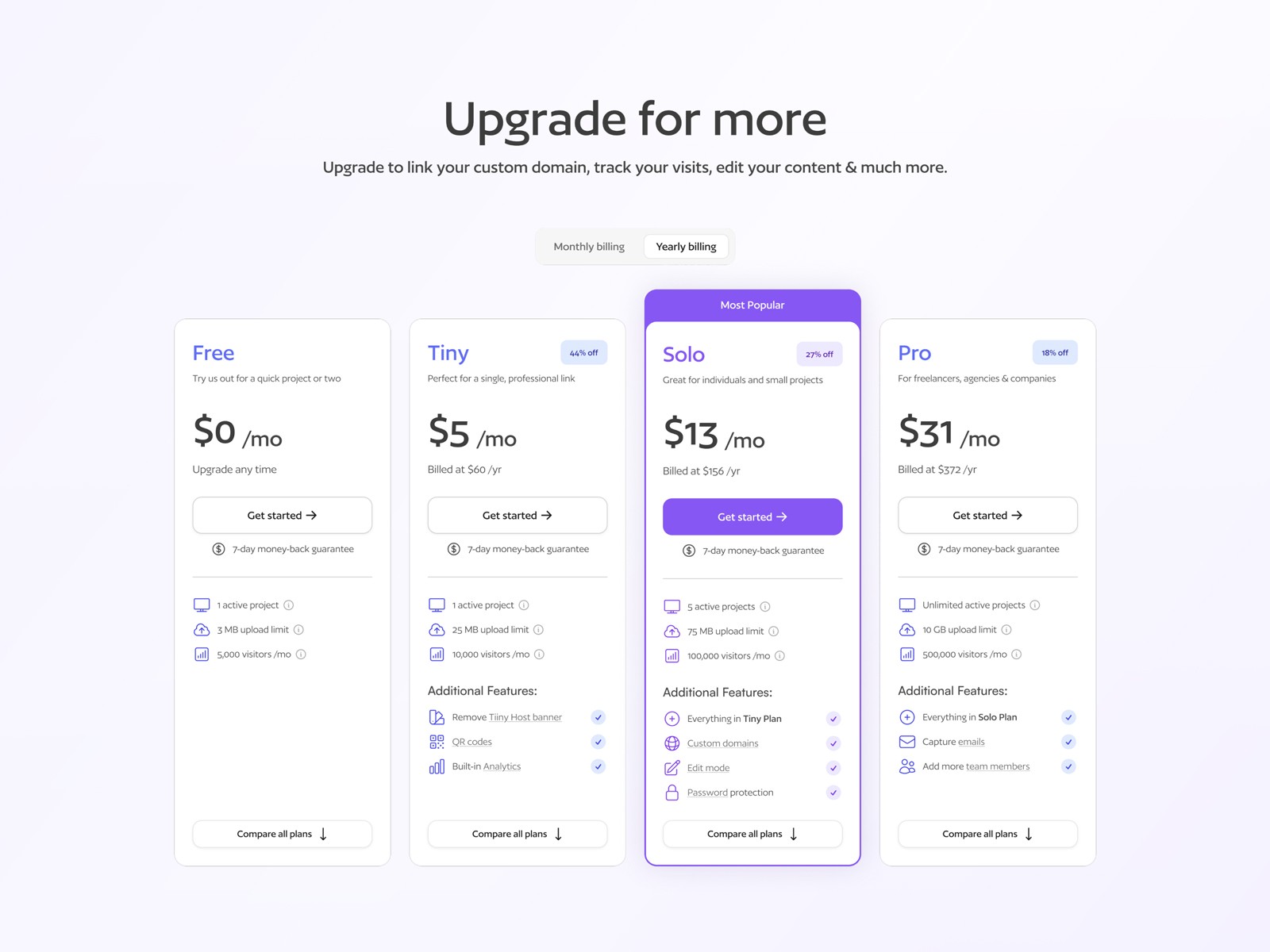
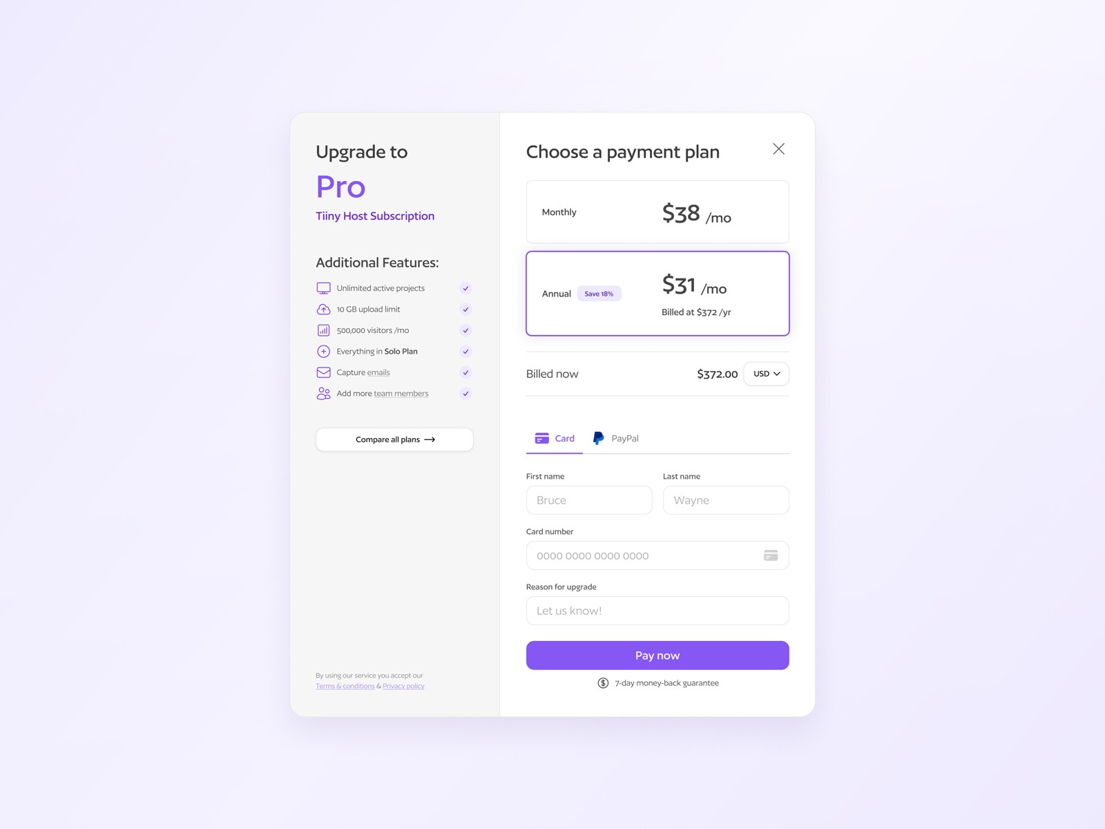
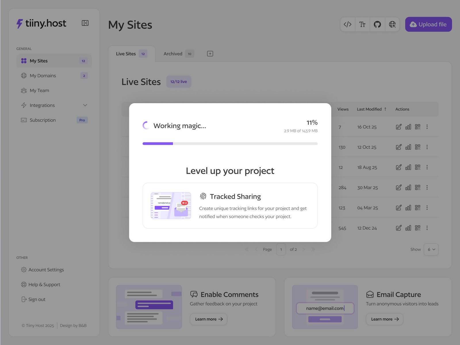
Key interactions such as uploading projects, editing projects/sites, and upgrading plans felt unintuitive and created friction in the user journey
Solution
We redesigned the homepage and some other key pages with a clearer, more intuitive layout highlighting Tiiny Host’s capabilities and better educated users on their service offering
A new design system was developed from the existing visual identity, creating consistent, scalable UI components and patterns across the platform
Content was streamlined and refined to ensure messaging was clear, helpful, and aligned with user intentions
Core user flows were reworked to make uploads, edits, plan upgrades, and other features smoother, more intuitive, and easier to navigate, greatly improving the overall user experience
